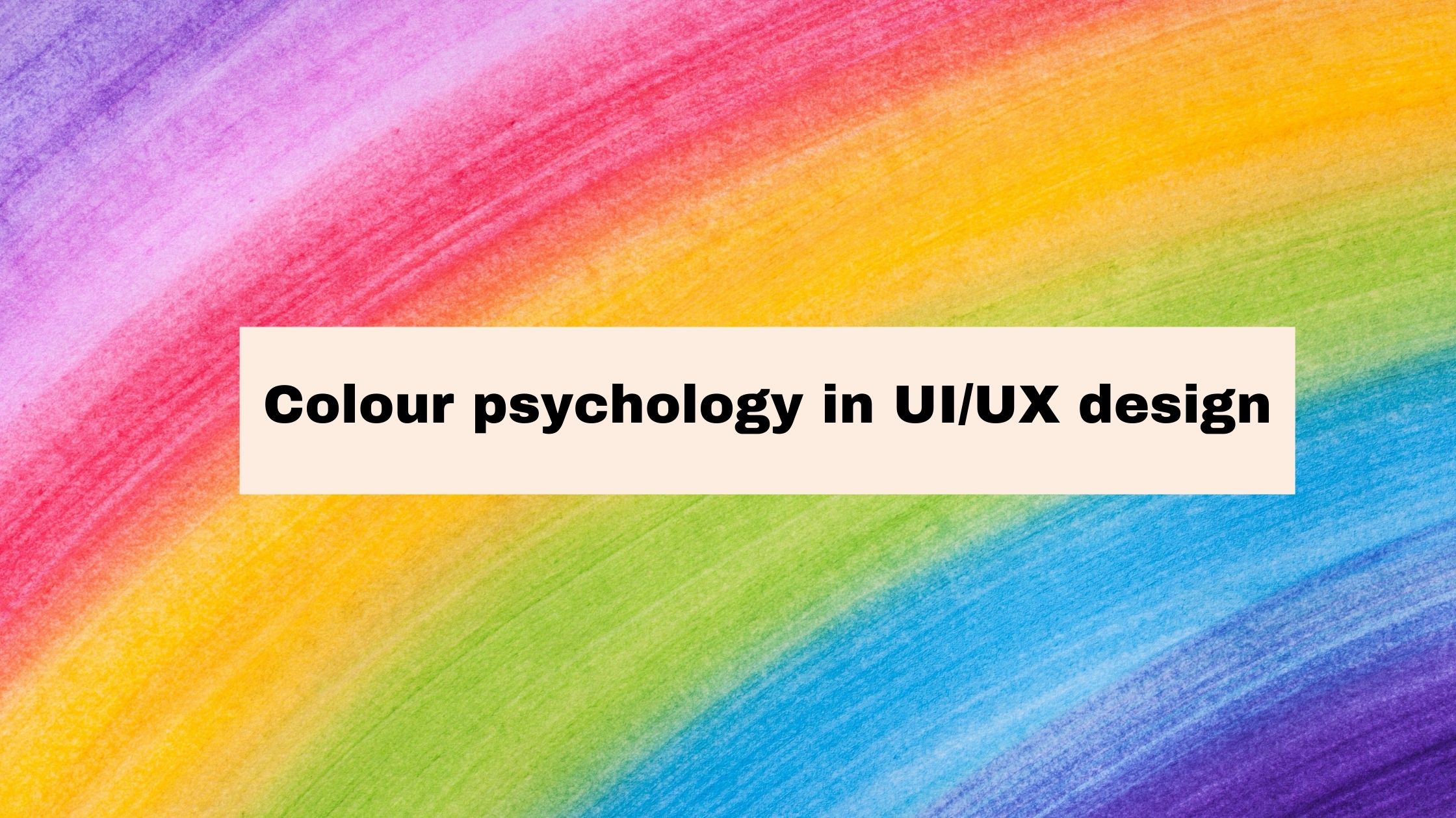
It is actually very exciting to see computer science to progress so much in today’s world. But there are also some parts of this stream which are a bit less developed and are still evolving. Among all the branches of the computer science field, UI/UX design has been a bit on the popular side now a days.
The UI/UX design has many important parts of which colour psychology is one, which is gaining importance slowly and steadily. If we consider it, then there are various factors which effect it like gender, and the psychological effects of different colours on the mind of a person.
A colour can make a person think differently and also can change the mood of a person. There is also a perception that the choice of a colour by a person depends upon the personality of the person. But from a designer point of view, it is a bit complex process to select a colour in a particular project.The selection of colours is based on the basis of a few sets of predefined theories.
The main factor for different colour tastes of people can be a result of different gender and so the different tastes of people. Taking a note of the study of Joe Hallock on this factor, we can say that there is a difference between the choice of colour of the different genders.
Now let’s take a look at the meaning of some of the colours in a brief.
Red colour
It gives a sense of importance and attraction. Example can be seen in terms of, as we all are well aware of the colour red which is being used by companies like Ferrari and football club like Manchester United.
Yellow Colour
It gives a sense of happiness and friendly nature. It is the colour which was used by the Taxis in Kolkata until recently, but it has been replaced now. But the choice of such a colour can be related to the fact that Kolkata is considered the city of joy.
Green Colour
This colour gives the sense of greenery and nature. It is no doubt one of the most important colours of our lives as it depicts the flora and fauna present around us as well as it can be considered as a sign of our healthy atmosphere to live.
Blue colour
It is a colour which depicts freedom and independence. As it is the colour of the sky, so it can be considered as a colour which depicts the prosperity of the Mother Earth.
But there are also some important terms which tend to categorize the colours on the basis of their effectiveness. Some of them are warm, neutral and cool colours. First of all, warm colour, such as orange, represent warmth as they remind us of the sun and fire. Secondly is the cool colour, for example, purple. The cool colours like purple have their own effect on the human mentality. Lastly is the Neutral colour. Colours like grey and shades of white are its examples. Now, these neutral colours depict dependability and trust.
Then, there is also the effect of colour on psychology or thinking process of a person. For example, colour black can be a symbol of attraction and strength. That’s the reason why it is used more in the fonts and texts everywhere. It is preferred by almost everyone as the first choice for any kind of text, as sometimes words can influence a person’s mind.
There is also an example, which can depict the use of colours by big companies for their products or for themselves. For example, blue colour, which depicts freedom and independence, is used by the denim companies to make their products more appealing. This in turn can help them to gain the attention of more young people for whom freedom is very important and they can relate that thinking to the colour blue and its appeal, more comfortably.
Now, we can take an example of an app with which we can understand more about the colour choosing process.
Suppose we are going to make an app for food ordering and the colour which is chosen by designer is black. Well, that can be due to the fact that designer is choosing colour purely on the basis of his/her own random choice or taste.
But this can be a bit bad from the design point of view. This is because designer need to have a sense of colour for their design. They need to understand the needs of a project or a client who is giving you the opportunity to do the project. This is important as it will help the designer to convey the right message to the users as there are different effects of different colours on the people.
So, it is important that we use the colours in a better way as a designer. Another important thing is the rule of 60:30:10. It means that we need to use a primary colour that uses 60% of the area, then we need to use a secondary colour that takes 30% of the space and finally there is also a third colour that takes 10% of the space. So, we can also use the different colours in a proportion for a better result.
Now, the next thing which needs to be taken care of in colour psychology are the three terms which are important if we are going to use different colours from a colour pallet. These terms are Hue, Value and Saturation. By following the works of Christian Vizcarra, I have tried to describe these three important terms to the best of my current capability: –
Hue
It is a term used for colour which is in its natural state or shade. Examples are red, green, blue, and many more. These are basically the colours that do not depict any shadow.
Value
In simpler terms it is the lightness of colour. It is the amount of light or darkness present in a colour. For example, the colour of sky has different shades during the morning and evening time. This is due to the fact that the objects present in direct light have a whiter background and the things which are in less light are in a bit of darkness and thus have darker shadow.
In terms of percentage, we can say that if a colour has 100% or more closer to 100% value, then it will have a whiter colour. On the opposite side, if a colour has 0% or close to 0% value then it has a darker colour.
Saturation
It is the darkness of a colour. If a colour is saturated then it is darker and vice versa. Another important factor for saturation is the end product which is our main target. If we are going to make a physical print copy of the colour then it will be problematic thing to perform, because of the difference we have in digital and physical print media in real world.
Now, if we again consider our food ordering app then we can use red and yellow colours in it. As depicted by some of the surveys present on the internet that the colours red and yellow increase a person’s appetite, which is the reason why big fast-food companies use such colours in their logos.
Conclusion
So, we can conclude that colour psychology is very important from a UI/UX Design perspective as it can have a huge impact on the overall appearance of the end product of a designer.
By: Raunak Jha
Write and Win: Participate in Creative writing Contest and win fabulous prizes.