
In today’s mobile-first world, creating a seamless user experience across all devices is crucial for businesses aiming to capture and retain customer attention. With the majority of internet users accessing websites via smartphones and tablets, having a responsive design is no longer optional—it’s essential. Companies that offer affordable email design services understand the importance of a well-optimized mobile experience, ensuring that every interaction with your brand is smooth and engaging, regardless of the device.
What is Responsive Design?
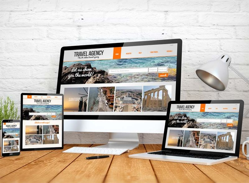
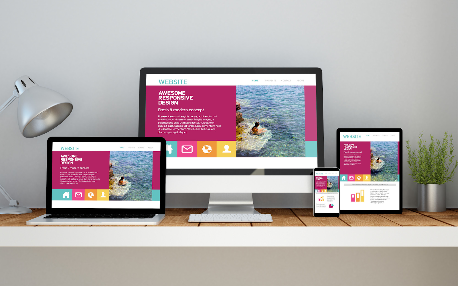
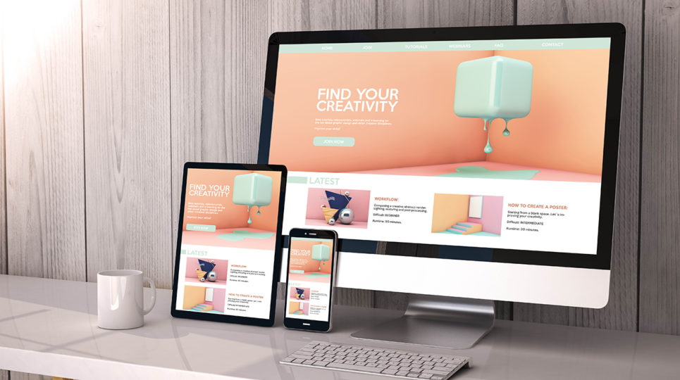
Responsive web design is a form of website layout that changes with the size of the device and the orientation of the screen. A user may be using the website from a PC, laptop, tablet, or Android smartphone, and the intended layout should suit each platform. This entails resizing content and design changes that move elements around to ensure that the usability and appearance remain excellent across devices.
Why Responsive Design Matters
Responsive design enhances user satisfaction by providing a convenient and usable Website across devices. This decreases the chances of bounce rates and increases conversion potential. Second, the key factor that relates responsive design to SEO is. It makes mobile-friendly sites appear at the top of the search results of some of the most popular search engines, such as Google, increasing your site’s visibility.
Also, a responsive design is flexible and cuts across several devices. It is time-saving and does not consume many resources. This option saves you the time and effort that you would otherwise spend designing two websites – one for the desktop and another for mobile.
Key Techniques for Creating Responsive Designs
1. Fluid Grids
Fluid grids are one of the main concepts in responsive web design. Unlike a fixed-width layout, where the width is set in pixels, a fluid layout uses relative units such as percentages to define the width of an element. Therefore, the layout scales proportionally with the size of the screen. This reduces the likelihood of awkwardly placing objects of various sizes on a single page while maintaining the site’s usability across different devices.
2. Flexible Images
Images are an important aspect of website design, but maintaining them is difficult, especially in a responsive design. To make the image fit all the available screen space and prevent scaling up larger than the given size on larger devices, apply a maximum width of 100% using CSS. This helps ensure that the image can shrink and grow in response to the screen size but retains its correct proportion. It is also suggested that you employ other techniques of mobile images like the srcset attribute to further display images based on the user’s device.
3. Media Queries
Media queries are special CSS rules that contain styles that depend on the specific characteristics of the device used by the user, for instance, the width, height or even the screen’s orientation. With the help of media queries, you can manage the layout and design of your website depending on the devices being used. For instance, one can alter the text size, make some components invisible, reposition them, or even make others appear differently on the small screens.
4. Mobile-First Design
An essential concept of a mobile-first is initially optimising phone applications, then enlarging the designs for other end devices. This method ensures your site is optimized for the marketplace’s smallest and most used devices. Sticking with Mobile’s first design means you have something very basic and simple that you can then add onto and add features for those larger devices.
5. Touch-Friendly Design Elements
With over 90% of mobile users engaging with websites through touching their screens, this is pertinent. It includes making buttons and links big enough to be easily clicked, maintaining space between the items, and excluding the effects which are not comfortable when transitioning from mouse navigation.
Enhancing Your Mobile Experience with 99 Dollar Social Reviews
Incorporating responsive design techniques is just one part of creating a seamless mobile experience. Getting help from short form video agency which specialize in optimizing your social media presence can ensure that your brand’s mobile experience is responsive but also engaging, and effective across all platforms.
FAQs
Q: How does responsive design differ from adaptive?
A: Responsive layout adapts fluidly to all screens, while Adaptive design provides fixed layouts that change at some media queries.
Q: How can I check whether my site is good regarding response?
A: Some tools include Google’s Mobile-Friendly Test, and doing a ‘Ctrl+Shift+I’ on your browser will let you see how your website looks on different devices.
Q: Why does mobile-first design matter?
A: A mobility strategy guarantees that your site conforms to the most popular devices, which in turn helps improve site navigation, consequently translating to a better SEO ranking.
Conclusion
Adaptive design plays a crucial role in designing a more effective mobile interface where the users are engaging and satisfied. These and other practices, such as responsive design, flexible images, and mobile-first design, allow your website to look and feel good on any device. Moreover, integrating with other social media, such as Feedbird and utilizing information from Compare local SEO services can enhance a mobile strategy to make your brand visible among the heavy competition in the modern world.
Write and Win: Participate in Creative writing Contest & International Essay Contest and win fabulous prizes.
About the Author