Rewind your memories to when the first touchscreen smartphones came out. The buttons were made to look like real buttons, the notepad resembled an actual leather-bound notebook, and the calculator had keys that mimicked a physical device. This was Skeuomorphism, a design approach that made digital interfaces feel familiar by imitating real-world objects.
Now, open your phone today. The apps you use look completely different—flat icons, subtle colors, and a minimalist aesthetic that prioritizes function over decoration. Over the years, designers moved toward Flat UI, prioritizing clarity and efficiency over realism. But recently, a new style has been making waves: Neumorphism. It brings back some of that depth and tactile feel but in a more subtle, futuristic way.
So, which approach makes more sense? Does Skeuomorphism still have a place in modern UI design? Is Neumorphism the future, or does it come with limitations? Let’s find out a bit about the origins, evolution, strengths, and challenges of both styles to determine which UI style makes the most sense right now.
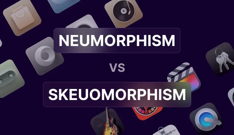
What Are Skeuomorphism & Neumorphism?
UI trends don’t just appear overnight. They change with technology, user expectations, and visual preferences. To understand where we are today, let’s first explore the roots of Skeuomorphism and the rise of Neumorphism.
Skeuomorphism: When Digital Looked Physical
In the early days of digital interfaces, users needed help transitioning from physical tools to digital screens. Skeuomorphism solved this by imitating real-world objects. This design trend was most famously championed by Apple’s early macOS and iOS interfaces—think of the pre-iOS 7 days when app icons had textures, shadows, and details that made them look three-dimensional.
Example: Apple’s original iBooks app featured a wooden bookshelf where digital books sat neatly arranged, mirroring a physical bookshelf. The Notes app looked like a yellow legal pad with lined paper.
For years, this approach worked well—until screens evolved, users became more familiar with digital interfaces, and designers started favoring cleaner, simpler layouts. By 2013, Apple replaced Skeuomorphism with Flat UI in iOS 7. This marked a shift toward minimalism.
Neumorphism: The Soft UI Revolution
Neumorphism (short for “New Skeuomorphism”) surfaced around 2019-2020, blending aspects of both Flat UI and Skeuomorphism. Instead of hyper-realistic textures, Neumorphism relies on subtle shadows, soft lighting, and an embossed effect to create depth.
Example: A Neumorphic button doesn’t have an obvious border. Instead, it looks like it’s slightly raised or recessed into the background, creating a sleek, futuristic look.
While Neumorphism gained popularity in experimental UI concepts, it also faced criticism—particularly around accessibility (low contrast can make it difficult for users with visual impairments). Today, designers are exploring hybrid approaches, mixing Neumorphic aesthetics with Flat UI elements to maintain usability.
Skeuomorphism vs. Neumorphism: Which Works Better?
Both styles have their strengths and weaknesses. While Skeuomorphism makes interfaces feel familiar, Neumorphism introduces a sleek, futuristic look. But which one actually works better?
Pros & Cons
Visual Appeal
Skeuomorphism: SkeuomorphismRealistic, nostalgic, engaging
Neumorphism: Sleek, modern, futuristic
User Experience
Skeuomorphism: Intuitive (mimics real-world objects) but can feel cluttered
Neumorphism: Minimalist, but lacks strong affordances (buttons may not look clickable)
Accessibility
Skeuomorphism: High contrast, easy to distinguish elements
Neumorphism: Low contrast, challenging for visually impaired users
Best for
Skeuomorphism: Apps needing realism (e.g., gaming, music production, simulation apps)
Neumorphism: Modern interfaces (e.g., fintech, health tracking apps)
Industry Adoption
Skeuomorphism: Rare but still used in VR, AR, and game UI
Neumorphism: Growing, but often mixed with Flat UI for usability
Industry Insights
So, how do these styles hold up in real-world applications? Let’s take a look at what research and case studies reveal.
1. Banking & Fintech Apps: The Usability Challenge
A 2023 IEEE study on Neumorphic UI in fintech apps found that while users liked its aesthetics, 68% struggled to identify interactive elements due to low contrast. Buttons, for example, appeared stylish but lacked clear affordance (they didn’t immediately look clickable).
Conclusion: Fintech apps benefit from a hybrid approach—using Neumorphism for aesthetics but incorporating Flat UI for clarity.
2. Accessibility Research: The Visibility Problem
A 2022 WebAIM report highlighted how low-contrast UI elements (common in Neumorphism) pose challenges for visually impaired users. As accessibility standards grow stricter, fully Neumorphic designs may struggle to meet compliance requirements.
Conclusion: Most brands avoid fully Neumorphic UIs, instead mixing shadows and depth with clear contrast for inclusivity.
3. Apple & Microsoft: The Future of UI
Apple’s iOS/macOS updates: Apple has started reintroducing subtle Skeuomorphic elements in its Vision Pro interface, balancing depth with modern minimalism.
Microsoft Windows 11: The Fluent Design System incorporates soft Neumorphic shadows, blending aesthetics with usability.
Conclusion: The future is neither fully Skeuomorphic nor fully Neumorphic—hybrid design trends are becoming the norm.
Where UI Design Trends Are Heading
As UI design evolves, rigid design trends are giving way to adaptability. Here’s where things are heading:
Hybrid UI is the Future: A mix of Neumorphism, Flat UI, and subtle Skeuomorphism ensures usability, accessibility, and aesthetics.
AI-Driven Adaptive UI: Future interfaces may dynamically adjust based on user preferences, switching between styles to enhance usability.
Skeuomorphism is Making a Niche Comeback: Expect to see it in VR, AR, and gaming, where realism enhances user experience.
Which UI Trend Should You Choose?
So, which UI trend is better right now? The answer depends on what you’re designing and who you’re designing for.
- If you’re working on VR, gaming, or simulation apps, Skeuomorphism still offers a sense of realism that enhances the user experience.
- If you’re aiming for a sleek, modern interface, Neumorphism can add a fresh, futuristic feel—but it needs to be balanced with Flat UI for accessibility and usability.
- If clarity and ease of use are your top priorities, a hybrid approach is the safest and most effective choice.
But beyond trends, great UI design is about how real users interact with your product—not just how it looks. The best interfaces feel natural, intuitive, and easy to navigate.
If you’re a business owner or product designer, keeping up with UI trends while balancing usability, accessibility, and aesthetics can be a challenge. That’s where the experts come in. Whether you’re refreshing an existing product or building a new one, working with an experienced UI UX design agency or professional ensures that your interface isn’t just trendy—it’s functional, future-proof, and built for real users.
Write and Win: Participate in Creative writing Contest & International Essay Contest and win fabulous prizes.